Visual profile for the new Øygarden municipality

Client: Øygarden Municipality

We created a visual profile for the new Øygarden municipality.

Work: Profile, logo, visual concept

When the municipalities of Fjell, Sund and Øygarden merged to form the new Øygarden municipality, they needed a profile and an identity that highlighted important values and the vision. We solved this by designing a clear profile and a concept with strilahaiku.

Image showing the new logo and slogan for Øygarden municipality. In the background, waves against rocks in Øygarden.

Background information

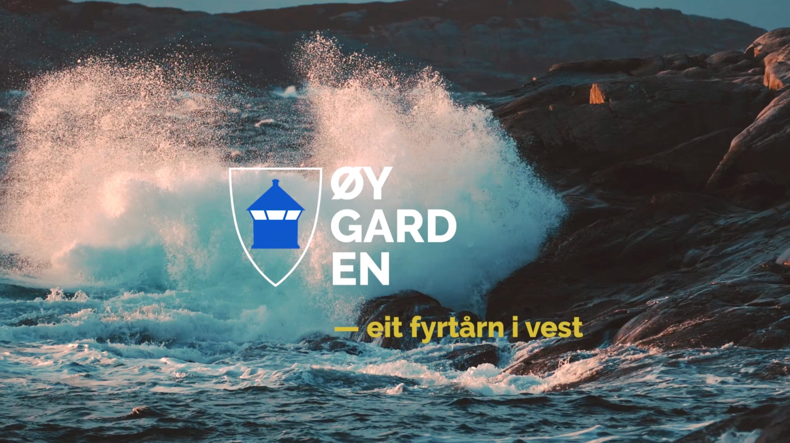
The letter of intent between the three merged municipalities provided clear guidelines for our work: The municipality will highlight important values such as shared culture, language and identity. The vision was also decided in advance: Øygarden - a beacon in the west

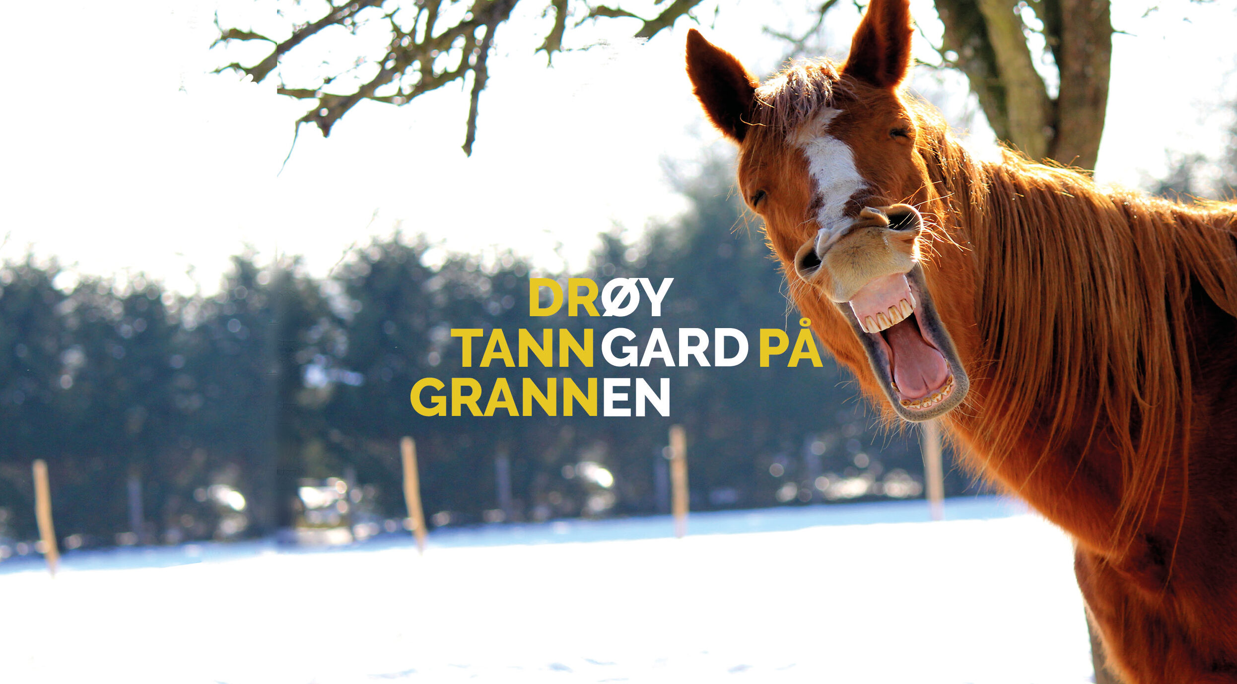
As part of our insight work, we organized a workshop with broad representation, where everyone was asked to bring something that describes the people and culture of the three municipalities. We heard about coastal women, fishing, courage, bridges, start-up environments and the willingness to invest. But not least, we were struck by the jovial humor that is peculiar to the straile culture.

Solution

The first project meeting was preceded by a poetry reading, so we understood early on that language and culture are strong in this municipality. This inspired us to follow a poetic trail of ideas.

We wanted to bring out the personality and avoid getting caught up in boring municipal language. People in Øygarden are far from boring!

The name itself is in three parts with the words ØY, GARD, EN. They create a compact and scalable shape that works well on all surfaces. The name tag also invites further creativity. We played around with words and phrases that became poetic verses inspired by Japanese Haiku poems. They were named Strilahaiku and are a humorous and nice way to add poetry to municipal communication.

The main color of the color palette is yellow and symbolizes the guiding light from the lighthouse. The other colors are taken from the sea, nature and the characteristic rushes that characterize the coastal landscape in Øygarden.

The profile also has a diagonal line - a cone of light - that draws inspiration from the lighthouse's light.
As befits a lighthouse in the west.

Image of Øygarden municipality's logo on yellow profile background
Strilahaiku for the municipality of Øygarden with the text "Løy vind i gardinane hos naboen", with highlighted sub-words that together make up "Øygarden". Behind the text is a picture of beautiful nature and a modern building in the municipality
Strilahaiku for the municipality of Øygarden with the text "Drøy tanngard på grannen", with highlighted sub-words that together make up "Øygarden". Behind the text is a picture of a smiling horse