
Websites that make complicated toll rates easy for everyone to understand

Client: Ferde
Work: Web development, web design, UX, UI, accessibility, integrations

We designed and developed a new website for the toll road operator Ferde, featuring a pricing solution that handles highly complex toll models.

Toll rates and toll financing are a complex subject. Ferde’s new website makes it easy for drivers to find the correct rate on their own and to see where the money goes.

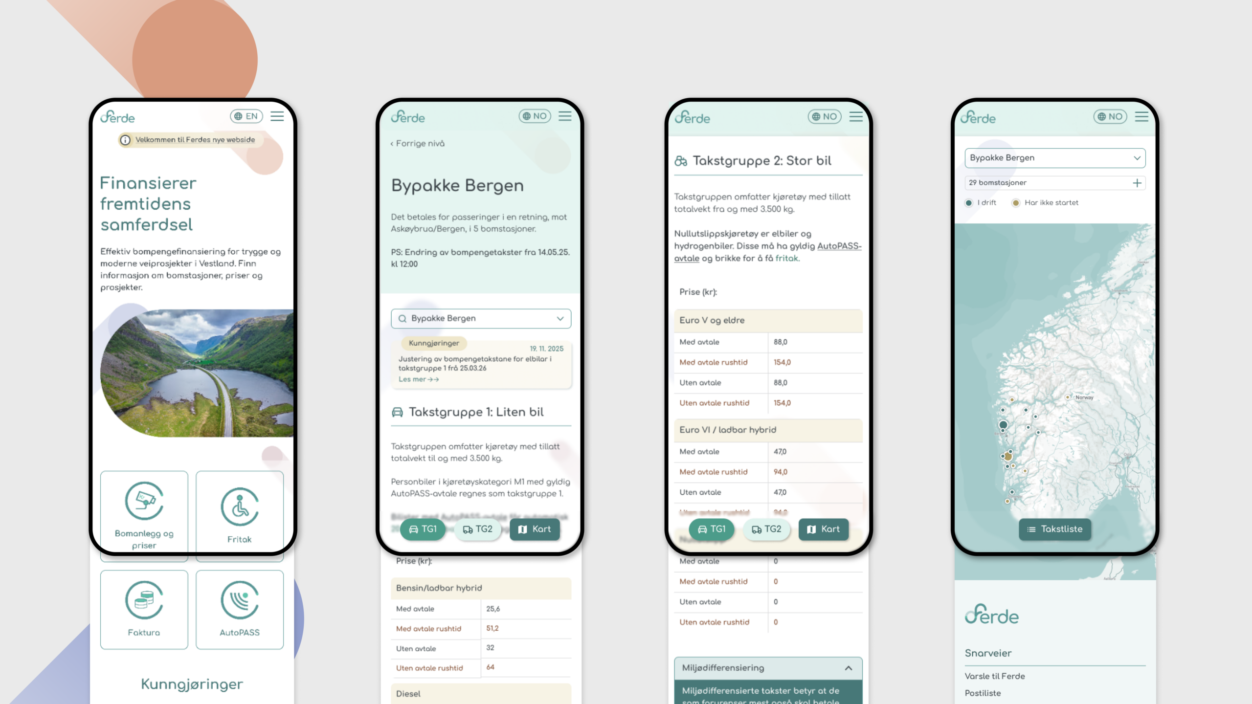
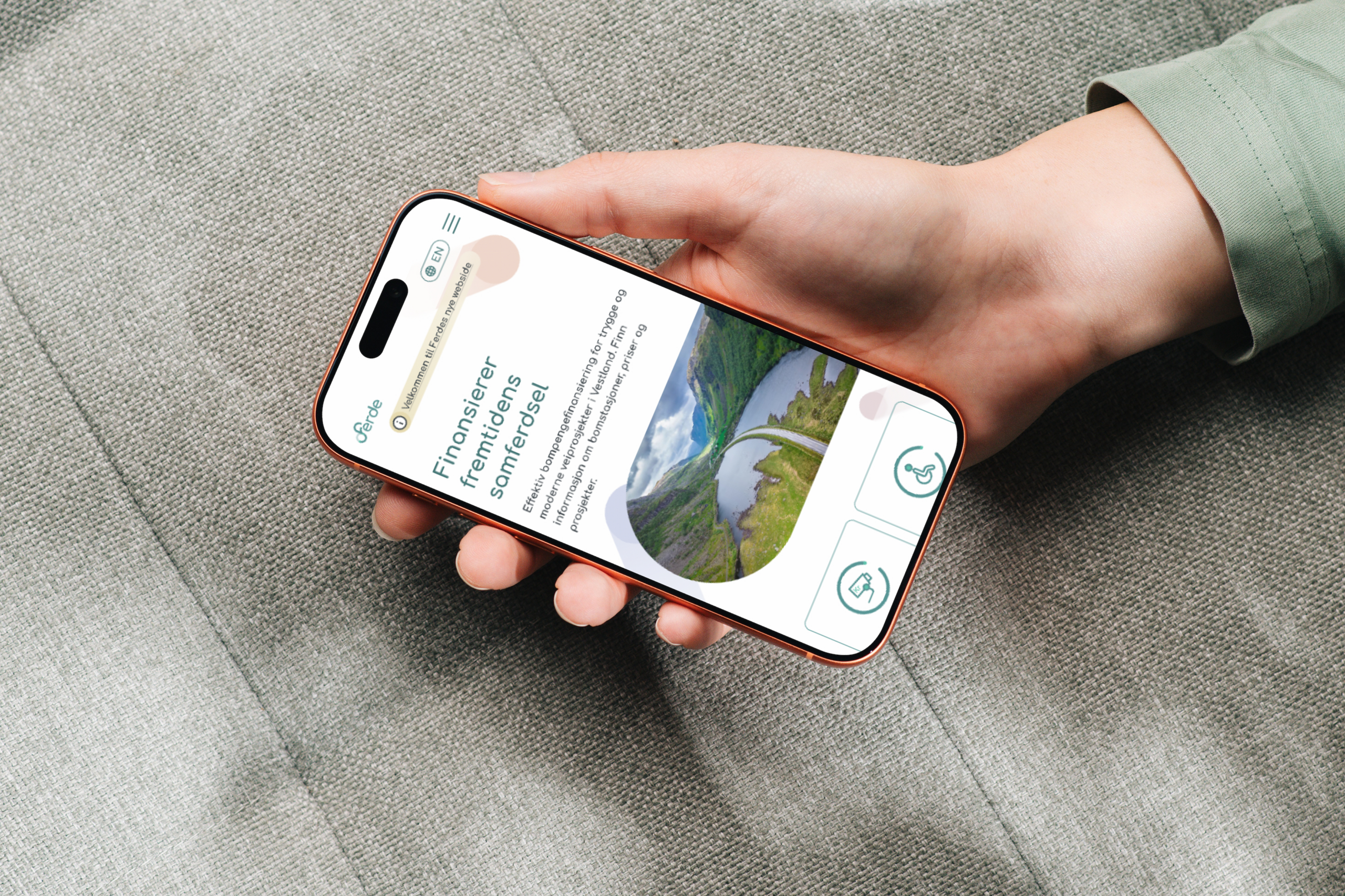
Mobile view of Ferd's website on a smartphone.

Background:

The regional toll road company Ferde is responsible for toll-based financing of road projects in Vestland, Rogaland, and Agder. The company operates 124 toll stations across 21 projects, ranging from urban packages and undersea tunnels to ferry routes and standalone toll stations.

The main purpose of these websites is to make it easy for drivers to see how much it costs to pass through a toll booth, with or without a subscription.

That’s easier said than done when prices are set locally and vary from project to project. Some road projects have rush-hour surcharges, some have different prices per station, and some have multiple toll rings within the same package. A few projects even have two different pricing models within a single toll package.

Ferde needed a new website that could present all this information in a clear and accessible way, that made it easy for Ferde to update the content on its own, and, not least, that was built in accordance with universal design requirements.
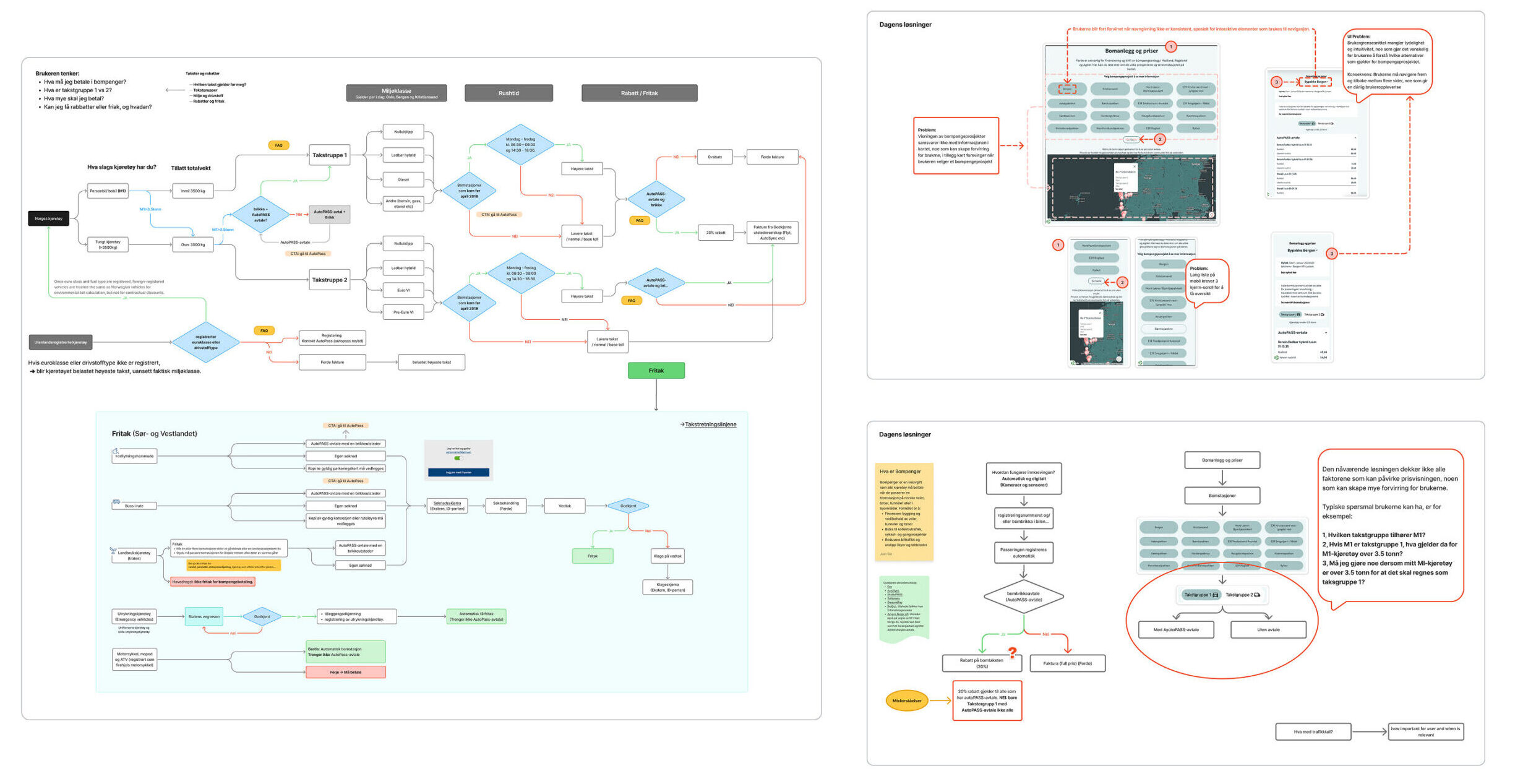
Analysis of the Existing Solution: Problems and Challenges
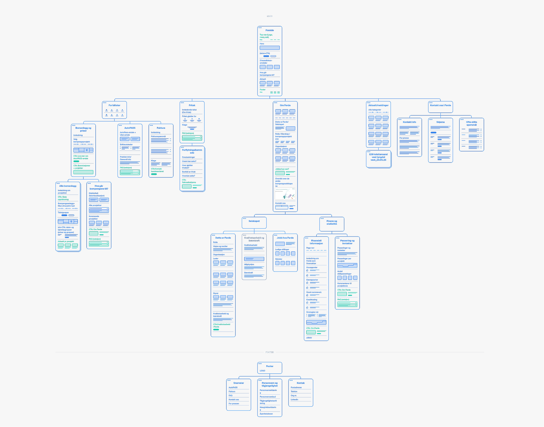
Information architecture and site map for Ferde's website, showing the structure and navigation between pages.

Solution:

We kept Sanity as our publishing solution and built a new front end in Next.js, focusing on performance, usability, search engine optimization, and universal design. The content and design were structured around Ferde’s various target audiences: drivers looking up toll rates, users applying for exemptions, the press and external stakeholders who need statistics, and owners and financial stakeholders who are following the projects.

The most challenging part was presenting the rates in a simple and understandable way.

Focusing on the User's Needs

The toll system is full of technical jargon, regulations, and internal logic that drivers—who are simply wondering how much it costs to pass through—don’t have the time or expertise to deal with.

We helped Ferde see things from the user’s perspective: how the information should be structured, what should be highlighted, and how the language could be made clear enough for drivers to easily understand and find what they’re looking for.

Using user needs as our starting point, we mapped out the structure of the pages and worked our way from a sitemap and simple sketches to clickable prototypes. This allowed us to test and refine the user journeys before a single page was developed.

The visual identity is based on Ferde’s brand profile, organized into a flexible design system of modular components that can be reused and combined in new ways. This ensures that the pages maintain a consistent look and feel and makes them easy to further develop over time without the overall design falling apart. Throughout the process, there was a constant balancing act between creative choices and universal design requirements, with the goal of creating a look that both reinforces Ferde’s identity and works for everyone.

The information architecture is structured around what users are actually wondering about and what they need to do on the pages. We created short and clear user journeys leading to the information people are looking for, organized frequently asked questions into clear categories on a separate page, and made key services—such as forms and contact information—easily accessible from both the main menu and the footer.

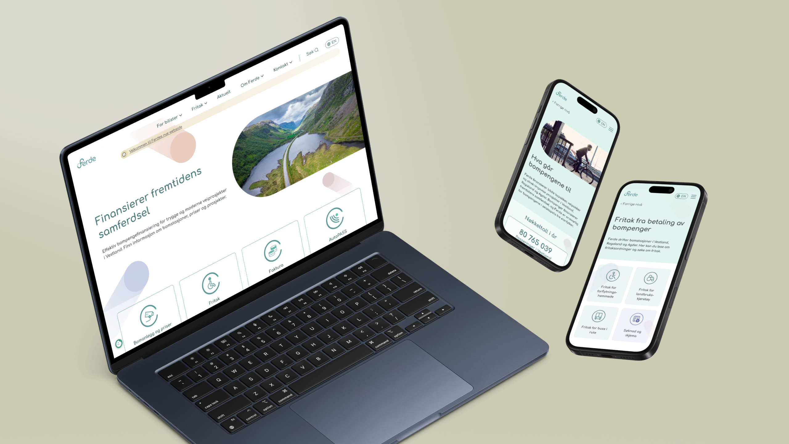
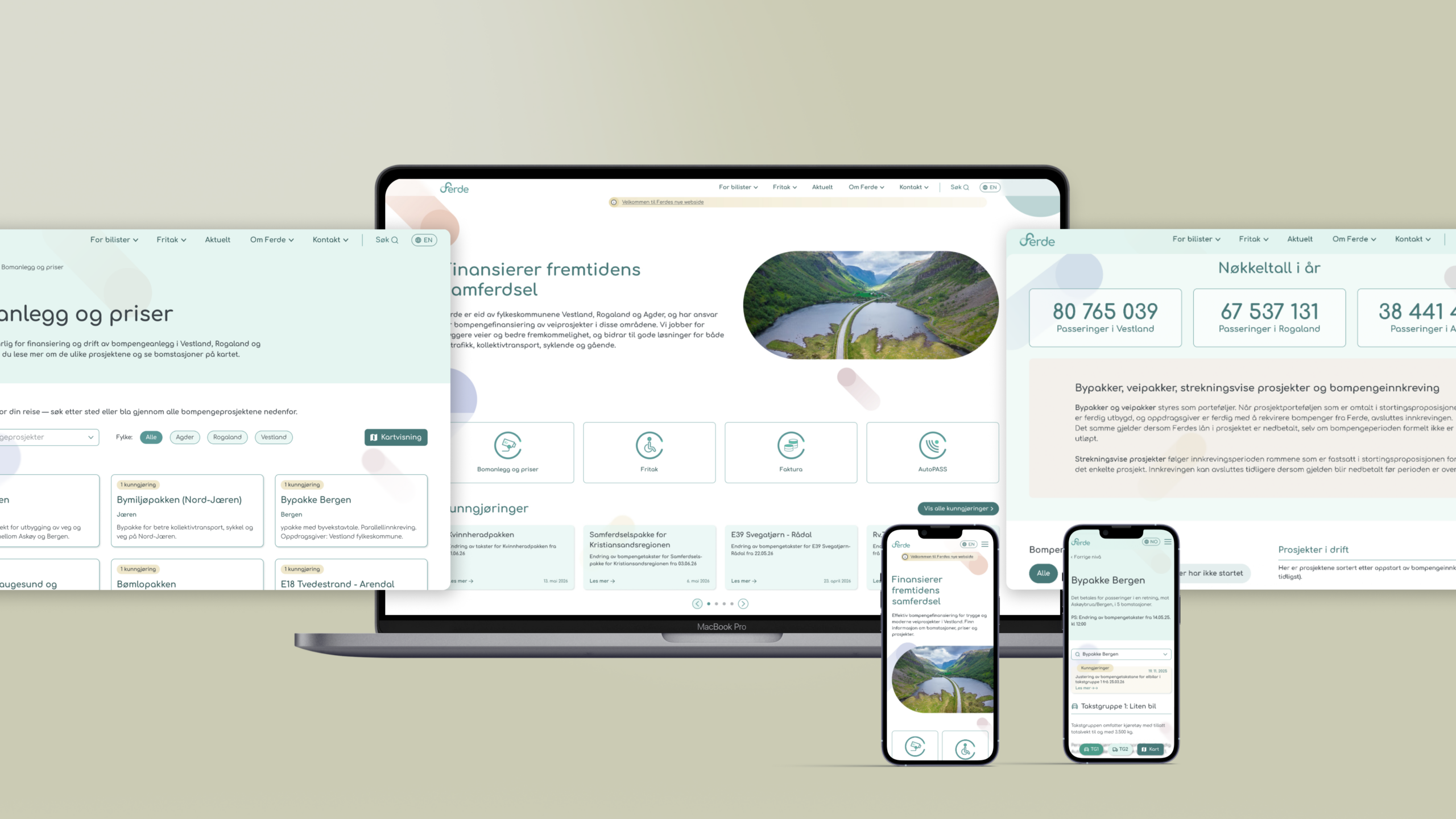
Mockup showing the ferde.no website on desktop and mobile
Mobile screens displaying the mobile-optimized user experience and key features of Ferde's website.
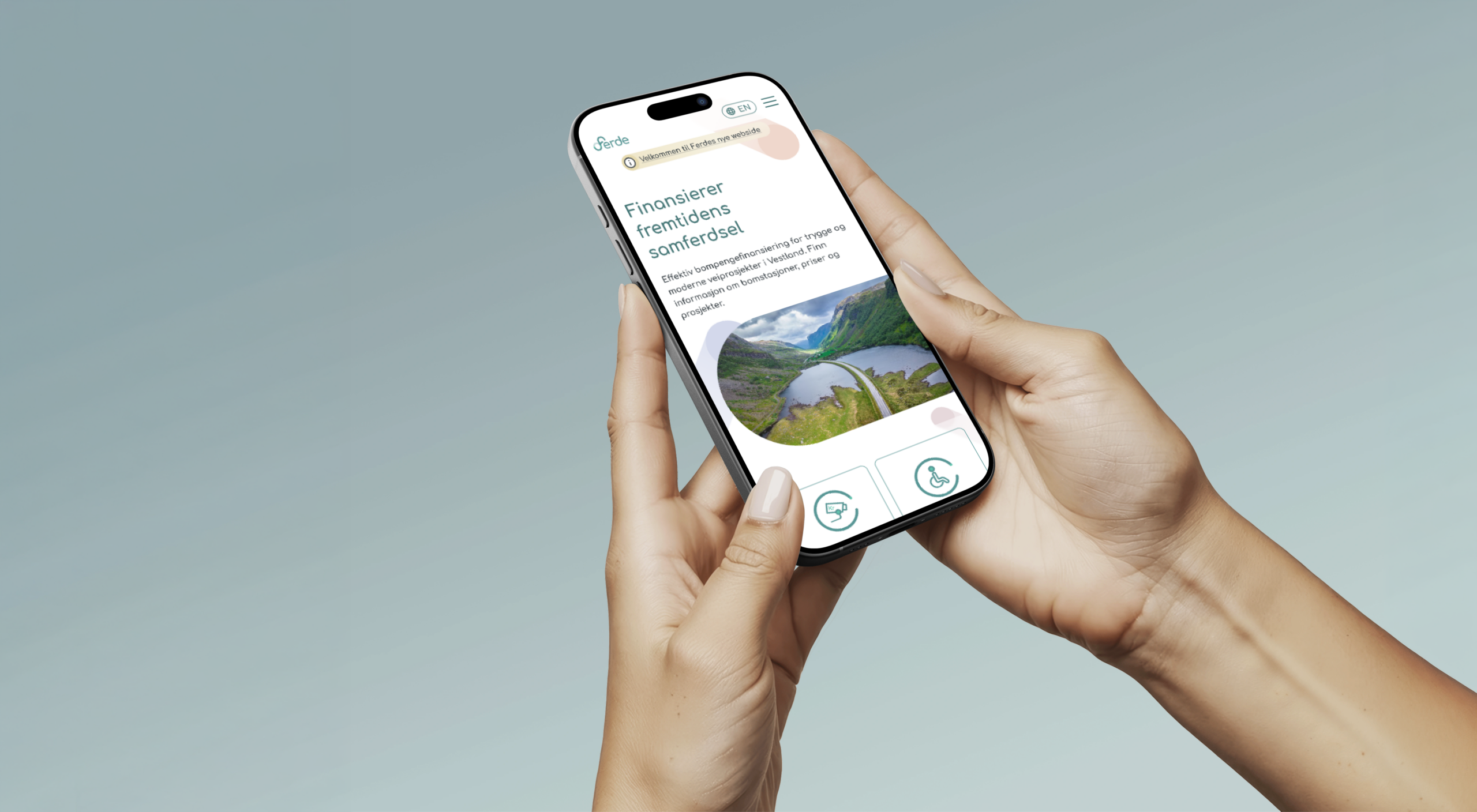
Mobile view of Ferd's website displayed on a smartphone.

Interactive Toll Station Map

All toll stations are displayed on an interactive map with their exact coordinates and the direction of toll collection. Prices are available directly in a pop-up when you click on a station, with the option to switch between "with" and "without" a contract,

For projects with multiple toll rings, such as the Urban Environment Package in Nord-Jæren, users can filter both the map and the list by one toll ring at a time. The map then automatically zooms in on the selected ring, so it is always clear what the prices apply to.

Simple and Automatic Price Overview

Toll prices are synchronized from a Fabric API every night, ensuring that 124 toll stations across 21 projects remain up to date without any manual effort on Ferde’s part. The synchronization process is designed to preserve old prices, even if they are no longer included in the latest update.

Updated Statistics

The website displays up-to-the-minute statistics on the number of passages and the revenue generated by the various toll packages, retrieved directly from Ferde's own systems.

Those who want to dig deeper can download the entire dataset as an Excel spreadsheet. Here, too, the numbers are retrieved directly from the source, so the download shows exactly what is displayed on the screen.

Universally Designed

As a public-sector organization providing digital services to the general public, Ferde must comply with universal design requirements. It was a constant balancing act between creative approaches and accessibility requirements, and we did not treat universal design as a final checkpoint, but rather as an integral part of the entire process—from insights and information architecture to design, development, and quality assurance. The pages are built in accordance with the WCAG 2.1 AA standard.
Ferde's website as viewed on a computer and a mobile device.