Back to the Roots: A New Visual Identity for the Norwegian Homeowners Association

Client: Norwegian Homeowners Association

We developed a new logo and visual identity for the Norwegian Homeowners Association.

Work: Logo, visual identity, color palette, typography, brand guidelines

We developed a visual identity centered on friendly professionalism. It is robust enough to convey the authority of the Norwegian Homeowners Association, yet warm enough to reflect its local membership.

Mockup showing the Norwegian Homeowners Association's new logo on a sign on a wall

The assignment

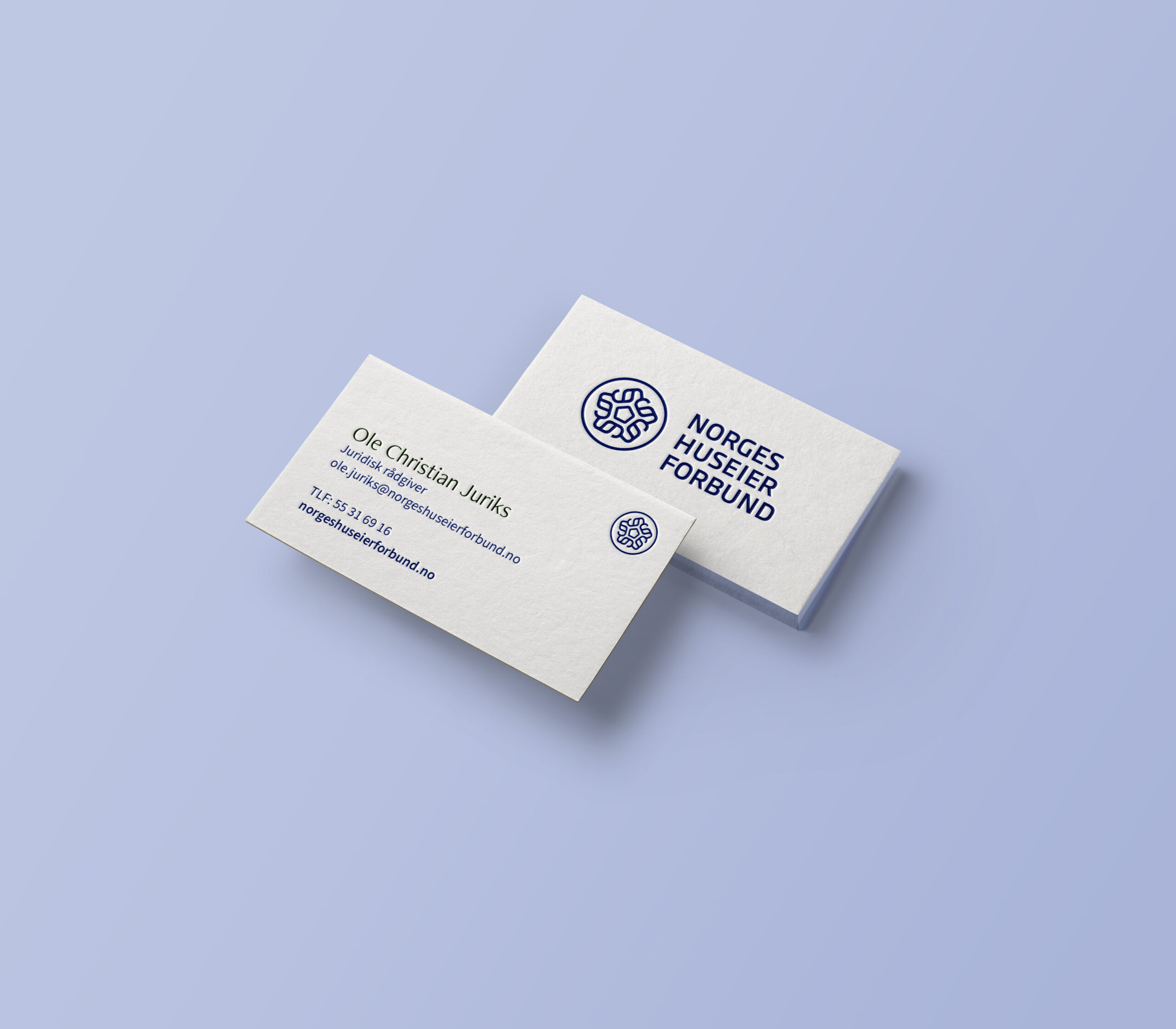
The Norwegian Homeowners Association is one of Norway’s oldest membership organizations for homeowners, with over 100 years of history. In recent years, the association has operated under the name Boligmentoren, but when it merged with the Bergen Homeowners Association, it decided to revert to its original name and develop a cohesive visual identity for the entire organization.

The identity had to lie at the intersection of two worlds: solid and trustworthy, yet at the same time personal and rooted in the local community.

Solution

The logo is built around five lines that encircle a house. This allowed us to create a distinctive symbol that stands out from our competitors’ more generic emblems. The symbol functions both as a complete logo with the name and can stand alone when space is limited, such as on social media. In addition, we created a separate version for the association’s local chapters, allowing local organizations such as the Bergen Homeowners Association to appear as part of the association without losing their local connection.

The color palette draws inspiration from the banking and insurance sector, but is deliberately built around extremes: deep, saturated blue contrasted with light, warm sand, with no midtones. This ensures that text and background always maintain good contrast and high readability.

The entire brand identity is compiled in a brand guide that covers logo usage, color palette, typography, and mockups for the member magazine, social media, and email signatures. The brand guide later served as the basis for the association’s new website at huseierforbundet.no.

Color chart for the Norwegian Homeowners Association’s new brand identity
Business card mockup for the Norwegian Homeowners Association
Mockup showing three versions of the new logo for the Norwegian Homeowners Association