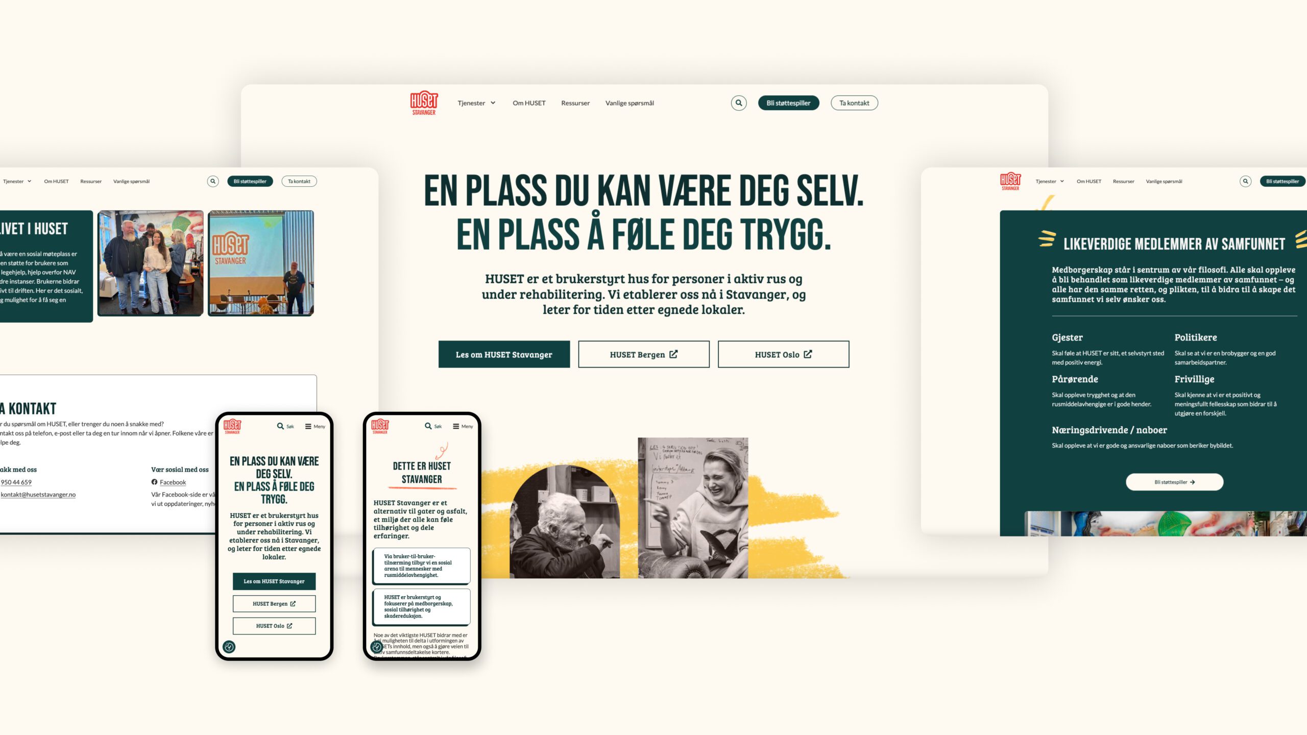
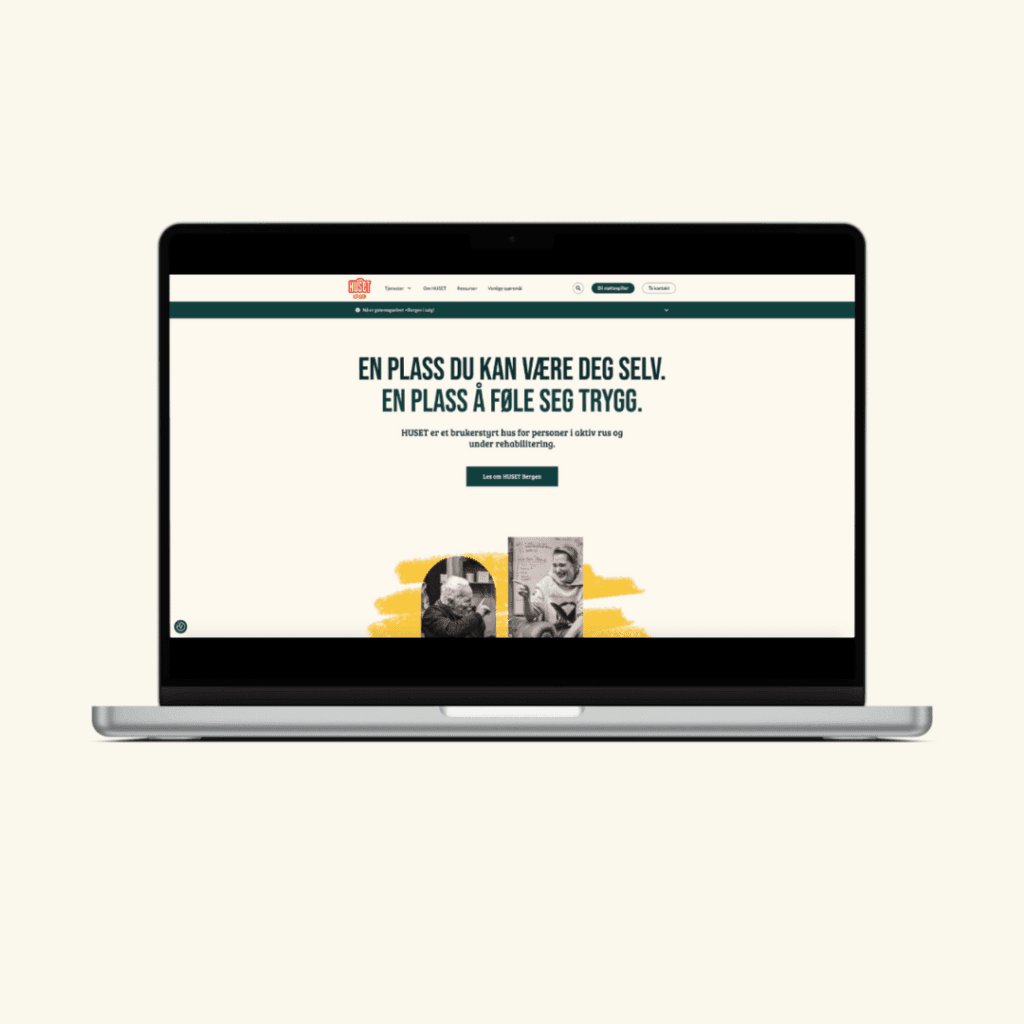
Huset Bergen in August 2022 with a concept that is entirely unique in Norway: a user-run facility for people who are currently using drugs or undergoing rehabilitation.
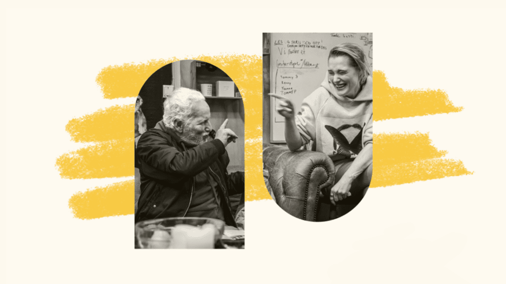
Here, the guests themselves decide what Huset be filled with, and all staff and volunteers either have personal experience with substance abuse or are family members of someone affected.
The most important keywords in their philosophy are citizenship, social belonging, hope, opportunity, unity and responsibility.
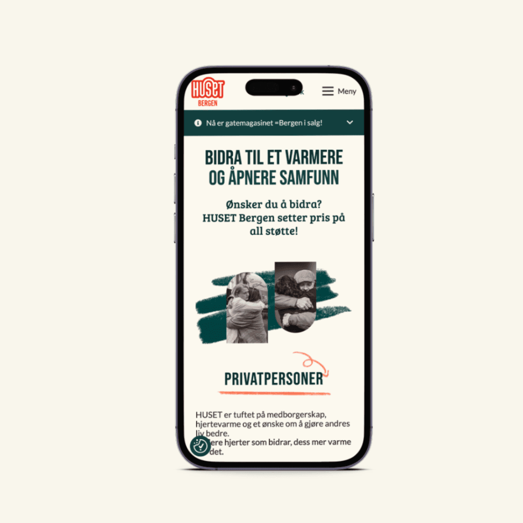
Huset Bergen entirely on support to maintain and expand its unique services. That is why they needed a website that appeals to financial supporters, informs family members, reassures neighbors, and highlights the residents as valued members of the community.
Our solution was a website that makes it easy to contribute support, provides information about the services offered, and represents and highlights the guests at Huset.
Since Huset Bergen in 2022, it has been joined by Huset and Huset .
A promotional video we created for Huset Bergen the substance abuse conference “We Can All Do Our Part, ” which they organized in collaboration with Bergen for the first time in 2024.
Citizenship as a UX principle
HUSET’s primary digital communication channel for its clients—that is, people with substance use disorders and former substance users in Bergen—is its Facebook page. Clients largely live their digital lives on their phones, and they have and use Facebook. That is why it is the best channel for reaching them.
Another important target group for husetbergen.no is stakeholders such as politicians, businesses, relatives and neighbors.
This doesn't mean that the websites are not adapted for guests. Quite the contrary.
One of the most important principles in HUSET's model is citizenship: Guests are full-fledged citizens like everyone else - and they should be treated accordingly. That's why it was only natural that the new website should be designed for guests, even if they are not its main users.
Drug addiction can often be a symptom of, or result of, mental or cognitive challenges. By accommodating these challenges, the sites will automatically work well for everyone else too.
In the design, we therefore applied UX best practices for conditions that affect cognition and attention. In short, it's about removing distractions, such as gestures and autoplay, and making it as easy and understandable as possible to use the pages.
They are also structured according to best practice for non-profit organizations that use the website to obtain funding and secure support. For example, "Become a supporter" is the clearest call-to-action and annual reports are highlighted to show financial transparency and seriousness.
Design: Street art and window views
The website should have the same atmosphere as Huset.
The design is heavily inspired by the guests’ interest in art. In particular, the colorful style of street art, which they themselves have used to decorate Huset . This is reflected in the color scheme, and is most evident in the hand-drawn elements.
This vivid portrayal is enhanced byMorten Hvaal’sstunningand candid photographs of the guests at Huset.
Hvaal’s photographs are displayed in frames inspired by the windows at Sverresgate 3. Visitors to the website get a glimpse of the life, warmth, and atmosphere inside Huset. Only one person is shown in each frame. This helps highlight the guests as individuals, rather than simply viewing them as a group.
Stripped-down functionality
The sites are built to make life easy, not only for visitors, but also for those who manage them. In the backend, the admin environment has been stripped down, while the need to update content has been kept to a minimum.
There are only two functions that require timeliness:
One is the gallery of photos from life at Huset. It’s easy to upload new photos from your phone or Facebook here, to show guests and stakeholders that there’s always plenty going on.
The second is the notification banner just below the top menu. The banner, which can be easily switched on and off, has three modes: green, yellow and red.
Green is for positive news. Yellow is for serious news that is not life-critical. Red is for life-and-death news, such as dangerous substances in circulation.
The result is a website that helps Huset Bergen raise funds, while also highlighting its guests as valuable individuals and members of the community.


