New visual identity for international songwriting camp in Bergen

Client: Bergen

We created a new visual identity for the international songwriting camp Bergen , organized by Musikkontoret Brak in Bergen.

Work: Design

By blending gender-neutral design elements with local and global influences, we have created an innovative and inclusive visual identity for Bergen .

Image of Berg Song's updated graphic profile, exemplified by colorful social media posts.
Bergen illustration showcasing the visual identity and a group photo from the 2024 songwriting camp

Bergen is aprestigious international songwriting camporganized byMusikkontoret Brak in Bergen. The first camp took place in 2021, but the organizers realized they needed a stronger identity and a more modern and accessible visual style.

Bergen brings together talented songwriters from around the world in Bergen collaborate, create, and share music. The new identity therefore had to transcend linguistic and cultural barriers.

Challenge: An inclusive identity

The camp also promotes inclusion with a gender-neutral approach and prioritizes sustainability. All of this meant that the new identity had to be universally accessible and welcoming, regardless of age, gender or cultural background.

These core principles guided us as we designed Bergen new visual identity.

Bergen illustration showcasing its visual identity through tape and stickers
Bergen illustrations showcasing its visual identity and innovative posters

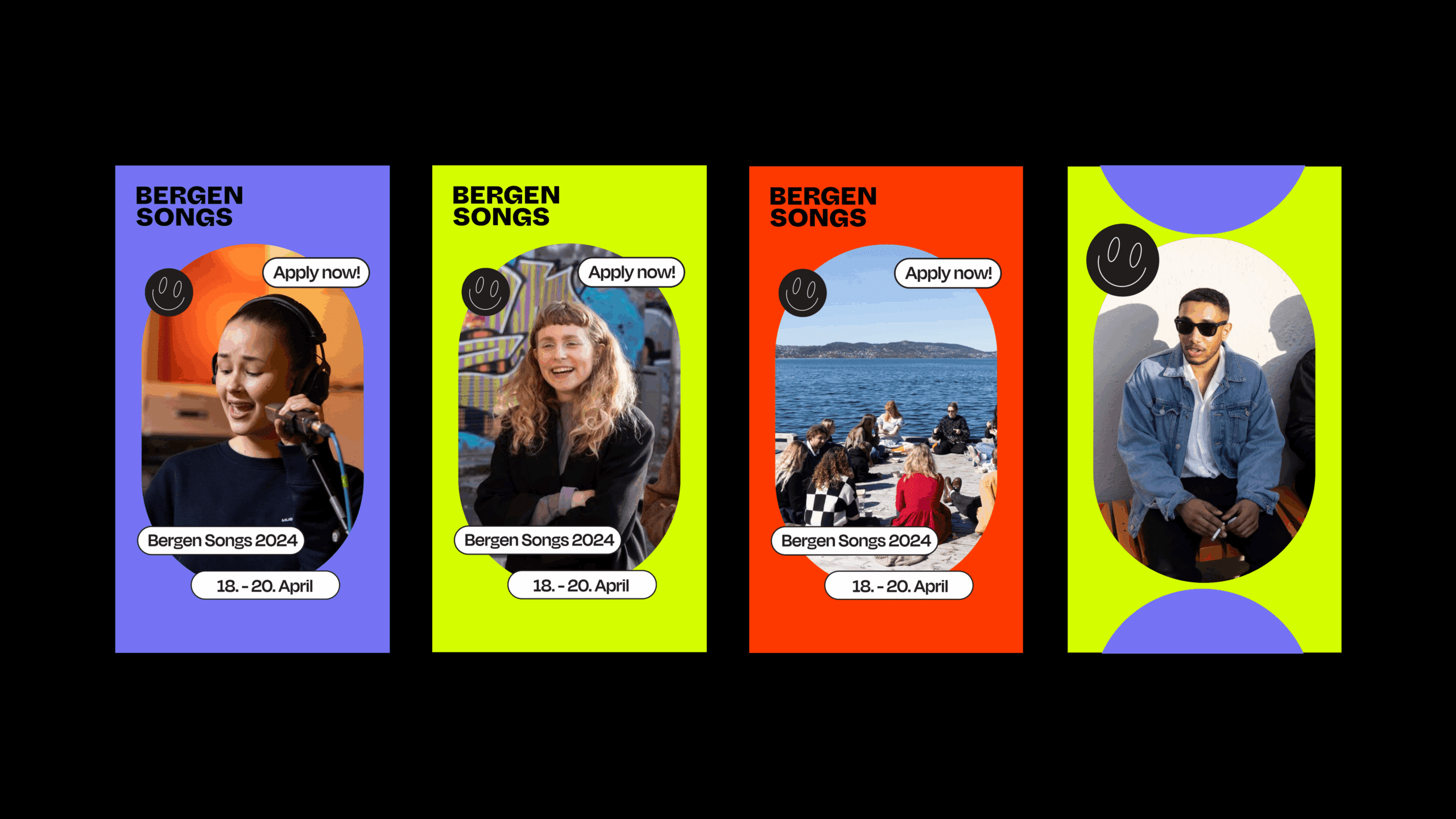
Solution: Innovative posters and neutral elements

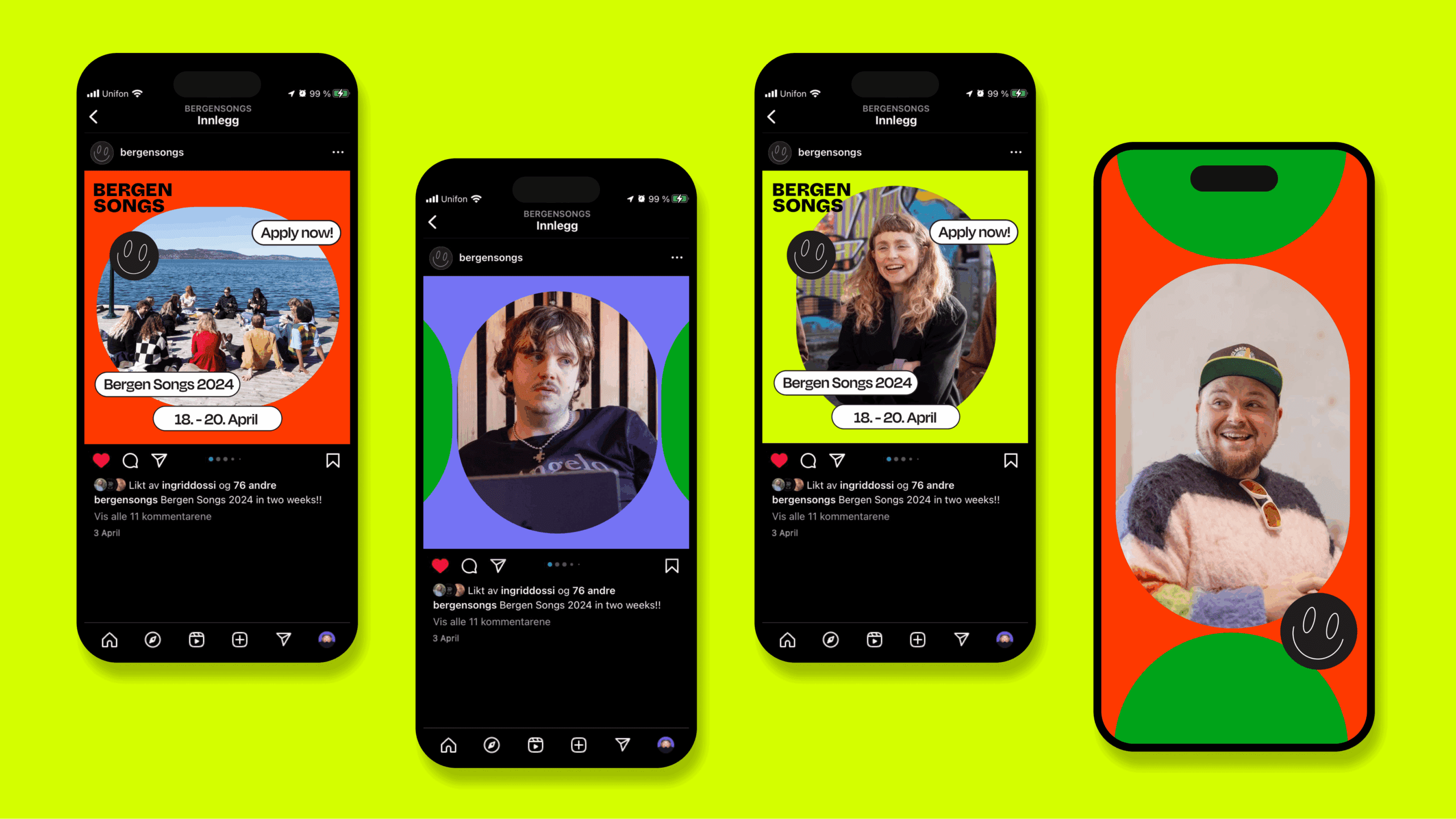
Accessibility is a key concept, with clear, easy-to-read typography and high-contrast color schemes to ensure good readability for everyone.

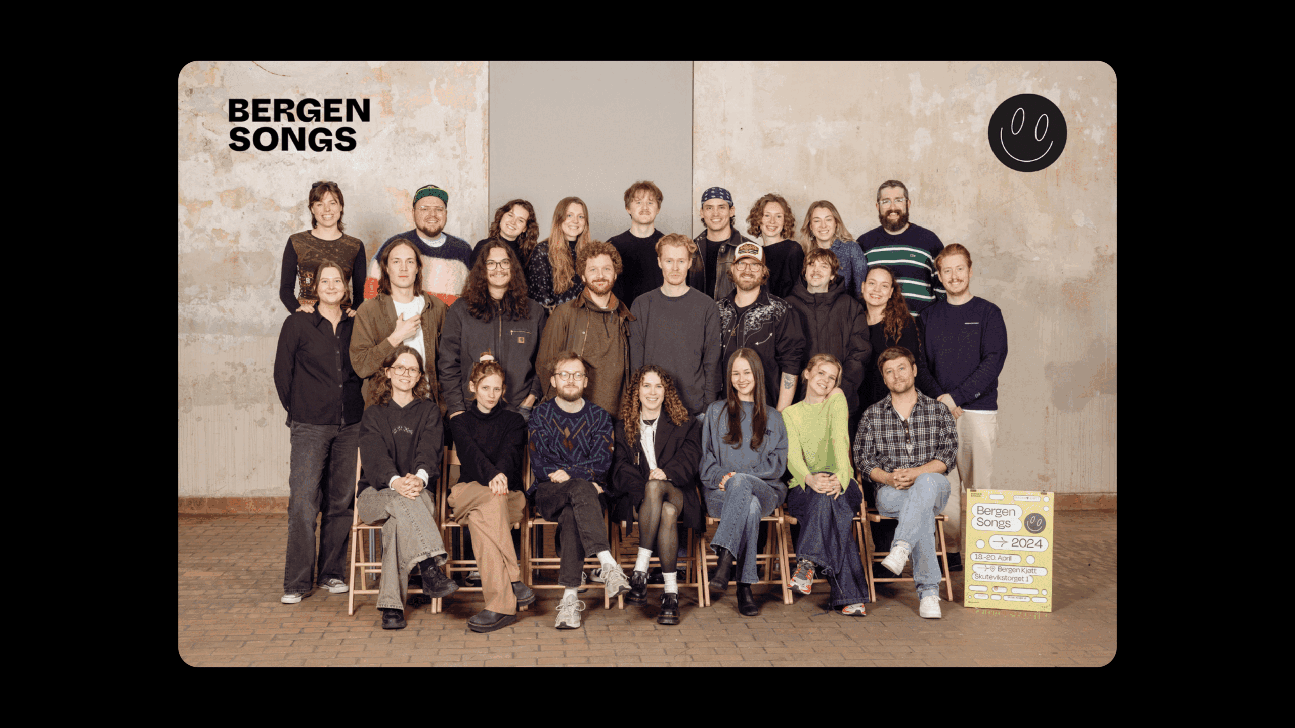
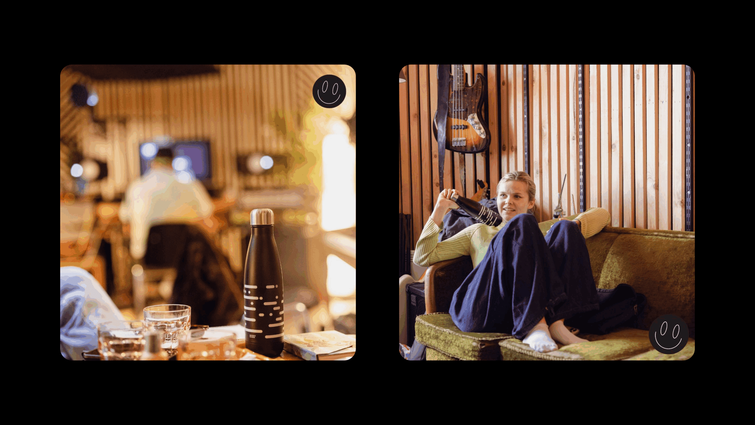
Design elements, such as shapes and colors, are gender-neutral to create an inclusive environment for participants of different backgrounds. A mix of local and global design motifs highlight cultural inclusivity and the rich spectrum of backgrounds represented at the camp.

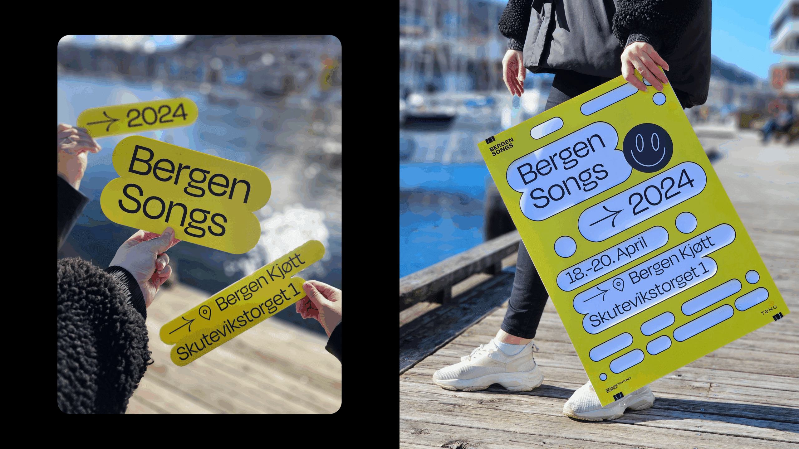
Since sustainability is a key principle for Bergen , it is also integrated into the brand’s visual identity—both through the optimization of digital resources and by using a reusable solution for posters and signs.

The front of the posters is fixed and reusable, while the back plate consists of a removable sheet. This allows them to update details such as date and location without having to replace all the signs and posters. This not only reduces waste, but also ensures that the posters remain relevant and up-to-date with minimal environmental impact.

Bergen illustration showcasing its visual identity on social media
Bergen illustration depicting its visual identity and bottle